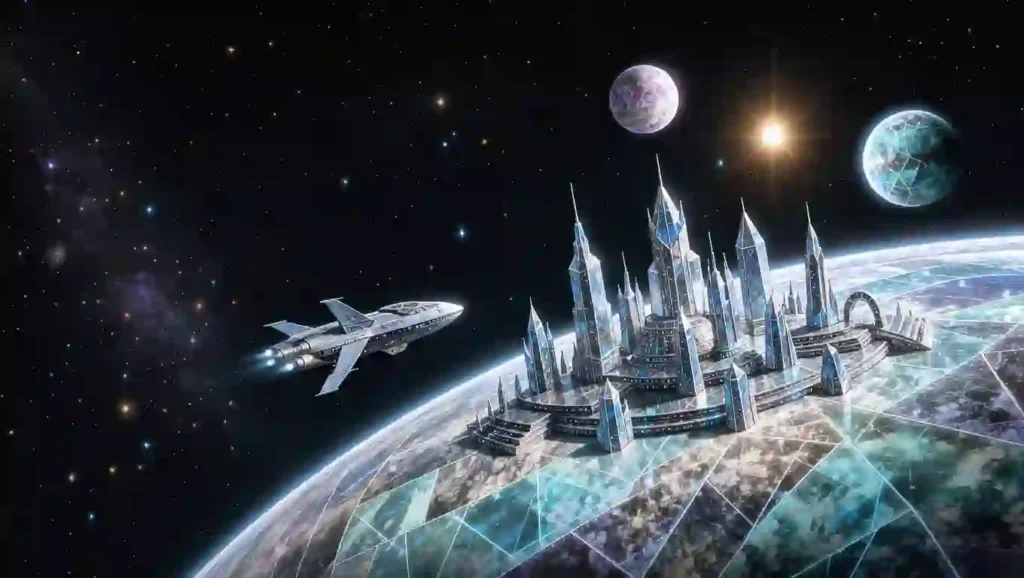
Arkon is more than a distant backdrop: it is the political and cultural heart of an ancient spacefaring power. Yet its most recognizable image—the three crystal worlds—can be easy to flatten into a generic palace planet. That misses the contrast that makes the setting interesting: beauty beside machinery, ceremony beside control, and immense imperial reach beside personal ambition. This guide gives artists and readers a grounded way to picture Arkon while leaving room for original interpretation.
What is Perry Rhodan Arkon System Art?
Perry Rhodan Arkon System Art means visual work inspired by the Arkon system and the wider Arkonid setting in the long-running PERRY RHODAN science-fiction universe. It can include planetary landscapes, orbital views, starships, imperial architecture, character portraits, maps, book-cover studies, or original scenes set among the Arkonid worlds.
The phrase describes a subject area, not one fixed official art style. The series has appeared across many novels and related formats, and its look has developed through different covers, illustrators, adaptations, and story eras. A fan artist can therefore make a recognizable image without copying a single cover or treating one personal design as the only correct version.
For a first Perry Rhodan Arkon System Art study, use the distinction between setting facts and design choices as your guide. Official introductory material places the Arkonid home in the M13 globular cluster and identifies Arkon I, Arkon II, and Arkon III as the system’s dominant crystal worlds.[1] The exact look of a city skyline, a palace interior, a transport vessel, or a citizen’s clothing can be interpreted by the artist unless a specific story or official image defines it.
That distinction helps both beginners and experienced creators. It protects the core identity of the setting while making room for new compositions, fresh color palettes, and personal visual storytelling.
The Arkon system at a glance
The Arkon system sits at the center of the Arkonid imagination: home, seat of authority, and symbol of an empire. In the series, Arkon is associated with a powerful civilization whose history, technology, and political traditions reach far beyond one planet. The official beginner overview describes the Arkonids as an old major power and names the three crystal worlds at the center of their home system.[1]
For a visual artist, the system works best when it feels like a connected place rather than three unrelated planets. Each world can have its own role and mood, while shared materials, symbols, light, and engineering make them feel part of one civilization. A wide orbital scene can show that relationship at a glance; a close-up can reveal what daily life looks like within it.
The following table is a practical visual-planning framework. It combines the established names of the three worlds with art direction ideas. Treat the role-to-mood suggestions as creative guidance, not as a universal technical specification for every story continuity.
| World or element | Setting anchor | Visual direction | Useful scene ideas | Details to keep flexible |
|---|---|---|---|---|
| Arkon I | One of the three central crystal worlds; closely associated with the Arkonid home and imperial identity | Monumental, ceremonial, luminous; use crystal-like surfaces as an accent rather than making every surface transparent | A palace approach, a capital skyline, a formal gathering, a landscape framed by monumental architecture | Exact palace plan, local climate, population layout, and the meaning of individual monuments |
| Arkon II | One of the three named crystal worlds | Distinct from the ceremonial image of Arkon I through its own skyline, terrain, and everyday scale | A transport hub, market district, industrial quarter, residential street, or orbital port | Specific economic function and geography unless a chosen source establishes them |
| Arkon III | One of the three named crystal worlds | Strong silhouettes, visible infrastructure, defensive geometry, shipyard-scale forms, and purposeful lighting | A fleet in orbit, an immense hangar, a command center, or a working city | Exact military installations, technologies, and historical role may depend on continuity and period |
| The system as a whole | A home system tied to the wider Arkonid civilization | Layer the planetary view with traffic, stations, craft, and distant celestial scale | A departure, arrival, diplomatic visit, fleet movement, or quiet view from orbit | Orbital distances, object counts, and astronomical details not stated in the chosen story |
| Arkonid society | An ancient, technologically advanced people with imperial traditions | Combine personal elegance with evidence of institutions, hierarchy, and long history | A public ceremony, an intimate conversation, a busy transit hall, or a moment of political tension | Clothing, insignia, social customs, and architecture should be checked against the exact era or source |
| Starships and technology | Advanced spacefaring culture | Favor readable shapes and purposeful details; make craft feel designed for a role | A vessel crossing a crystal city’s sky, a dockside inspection, or a ship viewed against a planet | Do not assume every vessel uses identical proportions, markings, or capabilities |
For a Perry Rhodan Arkon System Art reference sheet, this table is a storyboard aid, not an official encyclopedia entry. If you are illustrating a named scene, check the relevant novel or official reference first. If you are designing a new scene, make the creative decisions clear through context and composition.
Arkon I: the world that carries the imperial image
When people picture Arkon, they often begin with the most iconic impression: a world of striking crystal architecture and imperial ceremony. The official material identifies Arkon I among the central crystal worlds, but an artist still has choices about how to turn that phrase into an image.[1] Crystal need not mean a planet made entirely of glass. It can appear in faceted towers, translucent inlays, reflective stone, luminous civic structures, or a few carefully placed surfaces that catch the light.
A memorable Perry Rhodan Arkon System Art image starts by deciding what the viewer should feel before choosing details. If the scene needs awe, place a small figure against a vast palace façade. If it should feel welcoming, bring the viewer down to street level and show the movement of people, transit, signs, and light. If it should feel politically tense, let the grandeur remain beautiful while adding distance, guards, controlled entrances, or a vast empty hall.
A convincing Arkon I illustration also benefits from contrast. Pair polished ceremonial surfaces with marks of use: a worn stair, a crowded public passage, a service vehicle, or a worker repairing a light panel. These small signs make the world feel inhabited instead of staged for a postcard. They do not need to contradict the setting; they simply show that even an imperial capital has ordinary life behind its grand views.
Arkon II and Arkon III: give each world a distinct visual voice
The names Arkon II and Arkon III are essential to a complete system view, but artists should avoid repeating the same palace silhouette three times. The official introductory source establishes them as part of the trio of crystal worlds.[1] A good original image can give each planet a different visual rhythm while preserving shared Arkonid design cues.
In Perry Rhodan Arkon System Art, a shared design language can tie the worlds together without making them identical. You might repeat angular arches, an edge-lighting pattern, emblem placement, or a palette of cool stone and warm metal.
Then vary density, height, atmosphere, and scale. One world might appear open and ceremonial; another might feel busy and infrastructural; the third might feature docks, defensive structures, or industrial silhouettes. These are creative choices, not claims that every book defines the planets in exactly that way.
A helpful rule is to give each world one dominant visual verb. One world may welcome, another may connect, and another may command. The verb guides architecture, camera angle, crowd activity, and lighting. This keeps a three-planet panorama legible even when the viewer has never read the series.
Arkonid culture: make architecture tell the story
Architecture gives Perry Rhodan Arkon System Art a way to communicate history without a paragraph of explanation. Tall vertical forms suggest authority; repeated arches can imply inherited tradition; vast open plazas make public life feel ceremonial; layered additions can imply that the city has changed over generations. None of these visual cues is exclusive to Arkon, so use them with restraint and combine them with details that make the design feel specific to this setting.
PERRY RHODAN’s official overview describes the Arkonids as an ancient, powerful people and frames their culture through both impressive stature and contradiction.[1] That tension is fertile ground for art. A beautiful ceremonial space may hide systems of control. An advanced society can still have unequal access, old rivalries, or citizens who question inherited authority. A single composition can hint at that depth by showing different people using the same space in different ways.
For costume design, avoid decorating every figure with the same amount of ornament. Distinguish a formal official, a technician, a trader, and a civilian through silhouette, fabric weight, practical tools, and posture. Use symbols sparingly, and do not present a newly invented emblem as official insignia. A caption such as “original fan design” can help readers understand what is interpretation.
Color, light, and materials for an Arkon-inspired image
A focused palette helps Perry Rhodan Arkon System Art make a complex science-fiction scene easier to read. Start with a small set of base colors, then assign each one a job. Cool white, silver, pale blue, or stone can suggest reflective crystal-world surfaces.
Deep blue or charcoal can create depth in space. Warm gold, amber, or red can draw attention to a person, a signal, or an imperial focal point.
These are art-direction suggestions, not official color rules. The official source identifies the crystal worlds but does not prescribe a single palette for every scene.[1] You can use a muted palette for a grounded literary illustration, saturated colors for a cover-style composition, or a limited monochrome scheme for a map or concept sketch. The important thing is to control contrast: reserve the brightest value for the subject that matters most.
Think about how materials behave. A polished surface reflects nearby light; a translucent panel can reveal a silhouette behind it; matte stone absorbs light; a screen casts color onto the face of someone standing close. These simple observations make futuristic settings feel tangible. Use a few clear material cues instead of labeling every object with decorative detail.
Composition: make the scale understandable
A panoramic Perry Rhodan Arkon System Art composition faces a familiar scale problem: a planet-spanning civilization can overwhelm its viewer. If every structure is enormous and every spaceship is tiny, the viewer may admire the spectacle but lose a sense of place. Include familiar reference points: a person at a railing, a vehicle beside a tower, a door in a monumental wall, or a cluster of buildings receding toward the horizon.
For a system panorama, use three levels of scale. In the foreground, place a recognizable ship, station, or observation window. In the middle distance, show a planet with a clear silhouette or cloud pattern.
In the far distance, use the other worlds and the starfield to communicate breadth. Keep the brightest focal point limited; too many glowing planets, engines, and windows compete for attention.
For a character-focused artwork, let the environment support the story rather than overwhelm it. A portrait of an Arkonid diplomat might use an architectural edge and a reflected city to suggest status. A traveler’s portrait might show a transit terminal and unfamiliar scale. A quiet scene by a window can communicate homesickness more effectively than a battle fleet.
Ships, stations, and movement through the system
Spacecraft are not just decoration. Their shape can tell the viewer what they do. A courier might appear compact and quick; a passenger vessel may include visible windows or docking access; a military craft can be more angular or protected; a station can form a stable visual anchor against the movement of ships. These are flexible design conventions rather than fixed canon specifications.
Avoid turning every ship into a detailed silhouette with the same visual weight. Give one craft the clearest outline, then reduce detail as objects move farther away. Add motion through a small number of cues: engine light, a docking alignment, a trail of service craft, or a shift in the starfield. The goal is not to fill empty space but to make the system feel active and navigable.
A story-aware approach also asks who controls movement. Is the ship arriving as a guest, entering under inspection, fleeing, or traveling on an ordinary route? The answer changes the composition.
A controlled arrival can use an imposing station and a narrow path of light; an unhurried journey can show open space and a distant destination. One deliberate story choice gives the technology meaning.
What makes the art recognizable without copying a cover?
Recognizability comes from a combination of setting cues, not from tracing an existing image. A three-world reference, crystal-inspired architecture, advanced spaceflight, and the Arkonid imperial context can establish the subject. Then add a distinct camera position, original character design, new lighting, and a scene of your own.
Study official covers as historical evidence of how different artists interpreted the series, not as a template to reproduce. The official Arkon miniseries page presents the novels as a twelve-part story and identifies its creators and cover-art context.[2] That makes it useful for understanding the range of published visual treatment. It does not mean that an individual cover’s composition is free to copy or that its exact styling is universal across the franchise.
A good originality check is to ask: if the logo and title disappeared, would this still be a scene I created? If the answer is no, change the silhouette, focal arrangement, lighting, gesture, background, or narrative moment. You can keep the subject while transforming the expression. That is both more rewarding artistically and clearer for an audience.
Classic series and PERRY RHODAN NEO: check the continuity
PERRY RHODAN is a broad story world with different series lines and eras. PERRY RHODAN NEO retells and reworks the premise in its own continuity. Its official Arkon volume description places Perry Rhodan and his companions in the system in a specific NEO storyline, with the Epetran Archive as a key plot element.[3] A detail from that version should not automatically be treated as a fact about every classic-series scene, and vice versa.
Before illustrating a named character, event, or location, write down the continuity and time period you intend to depict. Then consult material from that same line. This short step prevents common mix-ups in character age, political circumstances, technology, and the state of the empire. It also helps you build a caption that readers can understand.
When your image is a broad mood piece rather than a scene from a particular story, say so. “Inspired by the Arkon system; original interpretation” is a simple, honest description. If you intentionally combine elements from separate story lines, state that in the caption instead of presenting the blend as a single canon moment.
A practical workflow for original fan art
Use this sequence to take a Perry Rhodan Arkon System Art concept from research to finished image:
- Choose a story question. Decide whether the scene shows arrival, ceremony, daily life, conflict, exploration, or departure. A clear action is more compelling than a collection of unrelated sci-fi objects.
- Name the continuity. Select the classic series, PERRY RHODAN NEO, or a clearly labeled original interpretation. Keep your references consistent.
- List confirmed setting anchors. Write down only the facts established by the material you are using, such as the world names or a named character’s role.
- Mark your inventions. Record your choices for architecture, costume, lighting, vehicles, and landscape. This keeps speculation from quietly turning into a false canon claim.
- Thumbnail the composition. Make several small sketches using different camera angles. Test whether the viewer can tell what matters in a few seconds.
- Choose the palette and light source. Give the scene one dominant light direction and a limited group of colors. Add accent light only where it helps the story.
- Check silhouettes. Reduce the image to dark shapes. The worlds, people, and ships should remain understandable before you add surface detail.
- Render materials selectively. Use reflective, translucent, and matte surfaces where they clarify form. Avoid making every object glossy.
- Review the reference. Confirm names, spelling, continuity, and any stated detail before you publish.
- Caption with transparency. Identify the source inspiration and note major original design choices. Do not imply official status or endorsement.
This workflow is useful for digital painting, traditional illustration, 3D scenes, maps, and short visual studies. It also gives viewers a more useful way to respond: they can discuss the story choice and design language rather than guessing which details are intended as fact.
How to make a system map or infographic
A map can be useful even when you do not know every astronomical measurement. Separate what a source states from what your diagram invents. Use labels such as “not to scale” when the layout is conceptual. Do not fabricate orbital distances, travel times, or planetary measurements and present them as official information.
Use a clear legend to identify the three named worlds and any added stations, routes, or points of interest. Use line weight or color to show categories, not to imply a relationship you cannot support. If an element is an artistic addition, mark it as “illustrative” or “fan-designed.” A short source note can name the official books or series material you consulted without adding links.
Keep labels readable at mobile size. Avoid packing the map with invented technical terms. A clean title, a small number of labels, and a short note explaining the continuity will usually help readers more than a dense graphic full of unsupported detail.
How to research the setting responsibly
Start with the primary story material for the scene you want to depict. Official series pages can help orient a newcomer, but a general summary may not include every detail needed for a particular era. If a point matters to your art—such as a character’s title, a location’s appearance, or a technology’s function—look for confirmation in the specific story or a reliable official reference.
Keep a simple research log with three columns: confirmed detail, source, and visual decision. For example, “Arkon I is one of the three named crystal worlds” is a confirmed setting anchor in the official overview; “its skyline has five silver towers” would be your own design unless the chosen story specifies that feature. This record makes later revisions easier and supports honest captions.
When sources differ because they belong to separate continuities or periods, do not force them into one answer. For Perry Rhodan Arkon System Art aimed at a broad audience, identify which version you are using. For broad promotional or educational material, note that story details can vary across the classic series and NEO. That caveat is more useful than pretending the entire franchise has one frozen reference sheet.
Common mistakes in Arkon-inspired art
- Treating all three worlds as identical. Give each a distinct visual function, mood, or silhouette while retaining shared design cues.
- Presenting invention as established canon. Label original buildings, symbols, and technologies as your own design unless the source confirms them.
- Mixing continuities without warning. Choose a story line or explain that the artwork blends material from different versions.
- Using “crystal” as a shortcut for transparency everywhere. Balance reflective or translucent surfaces with stone, metal, fabric, and practical structures.
- Adding detail without a focal point. Decide what the viewer should notice first, then simplify competing shapes and highlights.
- Making the civilization look empty. Add signs of ordinary use—people, transit, maintenance, trade, or public life—to balance monumental scale.
- Copying an existing cover composition. Use reference images to learn about visual history, then build a new angle and narrative moment.
- Making unsupported technical claims. A dramatic orbital diagram is still an illustration unless its numbers and relationships come from a source.
- Using a franchise logo as if it grants official status. Keep your authorship clear and avoid implying approval.
The strongest work is not the one with the most decoration. It is the one where every design choice supports a readable story and the artist is clear about what comes from the source and what comes from imagination.
Frequently asked questions
1. What does Perry Rhodan Arkon System Art include?
Perry Rhodan Arkon System Art includes original illustrations, maps, concept art, portraits, and scenes inspired by the Arkon system and Arkonid culture. It may depict the three crystal worlds, spacecraft, architecture, citizens, or events, provided the creator distinguishes source facts from personal interpretation.
2. Which three worlds make up the Arkon system?
Official introductory material names Arkon I, Arkon II, and Arkon III as the central crystal worlds.[1] Check the specific series line and story period before adding detailed claims about their geography, infrastructure, or political role.
3. Is there one official art style for Arkon?
No single visual treatment should be assumed to define every story and era. Published covers and illustrations reflect different creative interpretations. Use official material to understand the setting, then make original design choices and identify them honestly.
4. Can I draw Arkon if I have not read the novels?
Yes. Begin with official introductory material, choose one continuity, and keep your first image focused on a simple scene. For a specific character or event, consult the relevant story before presenting details as canon.
5. Is PERRY RHODAN NEO the same continuity as the classic series?
No. NEO is a distinct reworking of the premise with its own story developments. The official NEO description of its Arkon storyline is a useful primary reference for that version, but should not be applied automatically to the classic series.[3]
6. Can I sell fan art based on the Arkon system?
Do not assume that fan authorship automatically permits commercial use. Rights depend on the use, the material included, and local law. Seek permission or qualified legal advice before selling, licensing, or using official marks or artwork commercially.
Conclusion: create a view of Arkon that tells a story
Arkon becomes compelling on the page when grandeur has a human scale. Let the crystal worlds feel distinct, use architecture and light to suggest the empire’s history, and give every ship or character a reason to be in the frame. Keep canon facts tied to the continuity you chose, label your inventions, and make the composition unmistakably your own.
If you are planning your first Perry Rhodan Arkon System Art piece, start with one question: what is happening in this moment? Sketch a clear answer, choose a world and a point of view, then build the image around that action. Share the finished work with a short note about your sources and design choices—your readers can then enjoy both the world and the imagination you brought to it.